Stage Manager is, without a doubt, one of the most fascinating pieces of software I’ve seen from Apple in years. Released as the hallmark feature for iPadOS 16, Stage Manager reimagines the multitasking experience for the iPad — allowing you to run multiple windows simultaneously, resize them to your heart’s content, and turn the iPad into more of a desktop-like computing experience than ever before.
It’s an impressive pitch on paper, and one that I think has a lot of potential going forward. But after trying to use Stage Manager on my iPad Pro over the last few days, I’m really struggling to stick with it. It tries a lot of interesting things and could have a very promising future, but — at least in its current form — it’s going to remain disabled on my iPad Pro going forward.
The Stage Manager elevator pitch
Before Stage Manager, you had two main ways to multitask: you could run two apps side by side (Split View) or view a second app in a smaller, floating window over your main one (Slide Over). They aren’t the most robust multitasking tools on the planet, but they’re simple enough to work reliably.
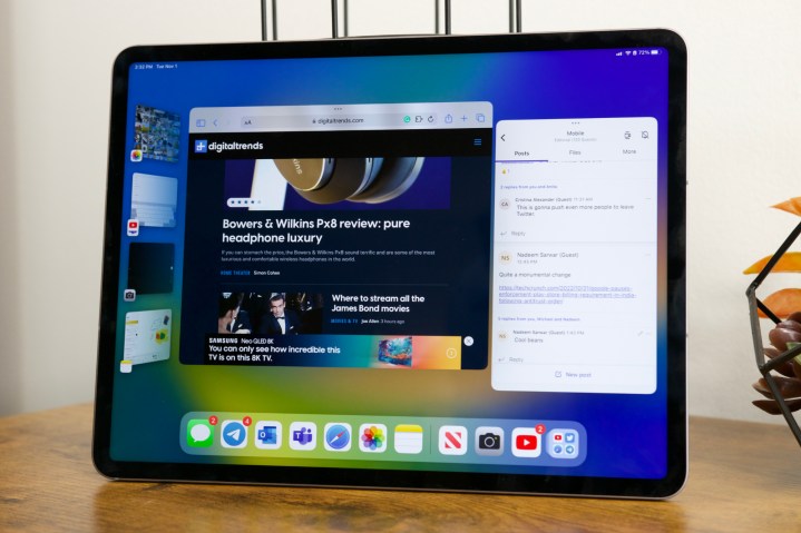
Stage Manager is a reimagining of how you multitask with iPadOS. Open an app and it now displays itself in a large window with your taskbar still visible below it, rather than taking up the entire screen. In addition to your taskbar, you’ll also see shortcuts for recently opened apps on the left-hand side of your screen. You can tap one of these apps to switch to it, or drag it on top of the app that’s already open.
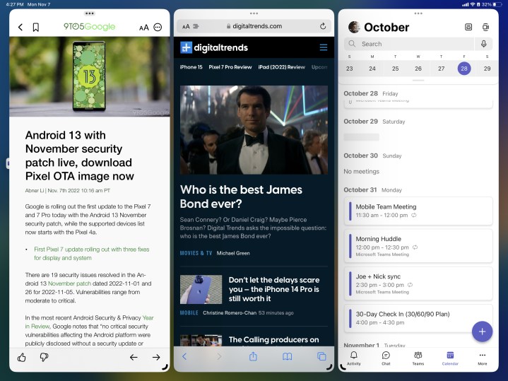
From here, Stage Manager works similarly to a desktop operating system like Windows or macOS. You can resize app windows, reposition them on your workspace, and run multiple apps side by side. Windows can also overlap each other, allowing you to really clutter up your screen if you want to.
Stage Manager is turned off by default on iPadOS 16, but you can enable it at any time by opening the Control Center and tapping the Stage Manager icon. When Stage Manager is off, multitasking on iPadOS 16 — with Split View and Slide Over — works just like it did in iPadOS 15.
Bugs, bugs, and more bugs
All of this sounds great, right? While it does on paper, Stage Manager fails in its execution of everything. The biggest problem — at least for me — is trying to stumble through Stage Manager’s confusing UX and numerous bugs.
Sometimes, an app will open in the windowed view like Stage Manager advertises. But if you close the app and open it again, it may decide to open in a normal full-screen view — making you question if you remembered to activate Stage Manager. I’ve yet to find any rhyme or reason for this behavior. It just happens, and it’s something you have to get used to.
Once you have an app open in a windowed view, tapping on apps in the shortcut menu on the left also behaves arbitrarily. Most apps will slide into view while still showing those app shortcuts on the left. Other times, an app may open in a windowed view but hide those shortcuts, requiring you to swipe from the left side of the screen to see them again. I’ve also had instances where tapping an app from the multitasking/recent apps menu erroneously shows a blank screen. If this sounds confusing to read about, it’s even more head-scratching to try and use.

At the point you finally get all of your apps running in Stage Manager windows, the problems don’t stop there. Here are just a few of the issues I’ve run into over the past few days:
- Some apps don’t scale properly when resized to smaller windows (such as Settings and Duolingo).
- The UI in the Messages app overlapped with itself, preventing the send button from working.
- In Outlook, the app would only let me type in the recipients and subject boxes — my taps/trackpad didn’t recognize the message body at all.
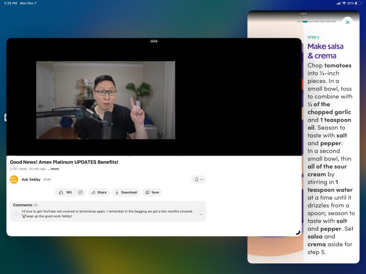
- While playing a YouTube video with picture-in-picture, videos often play when you’re on the home screen, but crash when you open another app.
These might sound like relatively small things on their own, but when you’re running into multiple of these issues within the span of just a few minutes, it creates an unreliable experience that’s extremely frustrating. Complaints of Stage Manager bugs aren’t anything new at this point, and over two weeks after iPadOS 16’s public release, those bugs remain as prevalent as ever.
A messy experience, even when it works
But even when you aren’t hit with bugs and Stage Manager works as intended, it’s not a space I find myself wanting to spend any time in.
One of the most frustrating aspects of Stage Manager is how it handles opening apps. If you open an app you haven’t used with Stage Manager yet, it opens in its own workspace with no other apps alongside it. From here, it’s easy to drag other apps onto your workspace and run multiple windows — simple enough, right?
Now let’s say you go back to your home screen and open another app you haven’t used recently. Instead of that app being added to the workspace you were just in, it creates another Stage Manager workspace. And if you open an app that was created in a workspace you may have forgotten about, you’re redirected to that old workspace to use the app there.
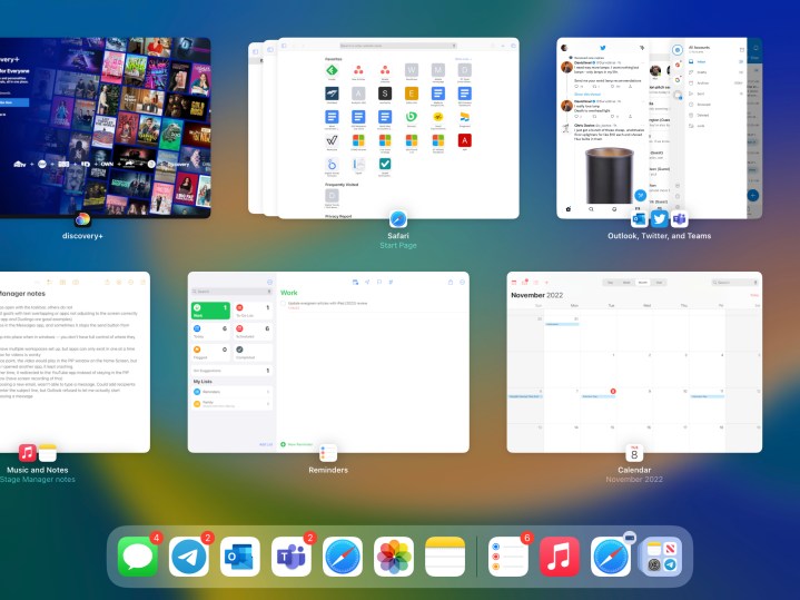
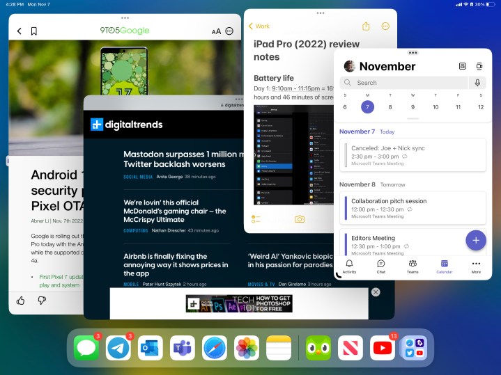
And things become more complicated still when you try to manage these workspaces. They appear in your recent apps/multitasking menu. A workspace with multiple app icons will display all of those apps when you tap it, while a single app icon only has that one app in the workspace. But that’s the important thing to remember. Apps you see in the multitasking menu are no longer just open apps — they all represent different workspaces on your iPad.
Look at the above screenshot as an example. If I tapped Reminders from the multitasking menu, I’d see only the Reminders app. But if I then tapped the Teams icon from my taskbar, I wouldn’t have the Teams app appear alongside the Reminders app — I’d be taken back to the workspace with Teams, Twitter, and Outlook. I think the idea of saving certain workspaces is good, but the way it happens with Stage Manager in iPadOS 16 is poorly explained and executed.
Where does Apple go from here?
The more I’ve sat down and tried to make myself understand Stage Manager, the more I’ve realized that it’s making my iPad work in ways I don’t want it to. It’s trying to create a desktop-like interface for a device that wasn’t meant to be a desktop machine, and I think that really shows.
When I use my iPad, I like to focus on one thing at a time and not much else. I appreciate running two apps side by side if I need that, or bringing up my messages in a Slide Over app and then hiding it when I’m done. Those things allow me to be more productive while still focusing on a single task at hand. And if I do want to switch from browsing Safari to scrolling on Twitter, all it takes is a couple of taps and I’m there.
Stage Manager feels like a weird half-step with its own confusing set of quirks and limitations.
Even with software changes and accessories like the Magic Keyboard, the iPad is still very much a touch-oriented mobile machine. And that shows in the fundamentals of how it works. When I tap Apple Music, I expect to see Apple Music on my screen — not Apple Music alongside three other apps in a Stage Manager workspace I created two days ago and forgot about. It’s useful to simultaneously run three to six windows on my Mac mini with a 34-inch ultrawide monitor, but less so on a 12.9-inch tablet display.
There’s a lot working against Stage Manager. Instead of bringing macOS to the iPad, Stage Manager feels like a weird half-step with its own confusing set of quirks and limitations.

It’s sort of like a desktop PC interface, but it doesn’t 100% feel like one. It’s a weird mish-mash of mobile and desktop UI ideas crammed together, and one that doesn’t fully operate like the iPadOS or macOS interfaces we’re so deeply familiar with. It crams bits of the two together, forms them into a Frankenstein feature, and the end result feels just as cumbersome as that explanation.
I applaud and appreciate Apple for trying to reimagine what multitasking can look like on the iPad. It’s a pain point many folks have complained about for years, and although it may not be perfect, Apple tried to do something about it with Stage Manager. But where do we go from here?
That’s the million-dollar question. Apple could keep tweaking and fine-tuning Stage Manager, but unless the core fundamentals of it change drastically, I don’t see myself becoming a fan anytime soon. And at that point, you may as well slap macOS onto the iPad — something Apple may or may not be playing around with. Stage Manager is potentially neat, and I want to love it. But right now, I just can’t.
Editors' Recommendations
"stage" - Google News
November 09, 2022 at 07:30PM
https://ift.tt/tyQ0SHn
I tried using Stage Manager on my iPad Pro, and I failed miserably - Digital Trends
"stage" - Google News
https://ift.tt/wCSR6Y5
https://ift.tt/s6908ZS
Bagikan Berita Ini


0 Response to "I tried using Stage Manager on my iPad Pro, and I failed miserably - Digital Trends"
Post a Comment